
How do you ship 20 variants of one widget that don't feel redundant? Group them into four thematic families of five, so the range reads as deliberate instead of desperate. The long answer has more to do with physics than typography, and with one rule I keep learning the hard way: a lab page can absorb variety that a marketing page cannot.
The problem with shipping 20 variants of anything
I rebuilt the flip-card widget on my lab page this week. The old version had six variants, which felt thin. The new version has twenty, which felt risky. Six was small enough that every treatment had to pull its weight. Twenty is large enough that a few weak ones dilute the set. This kind of decision is the daily diet of a one-person studio; it is the same loop I describe in the broader operator playbook for creative-tech solos and the same review cadence I use on the Mac-to-Windows image pipeline, where the same button-driven HTML grid picks the keepers out of a batch.
The first failure mode is obvious: 20 spins on the same gimmick read as filler. If every variant is a rotateX with a different color, visitors perceive one idea repeated twenty times. The range becomes a liability instead of a feature. They scroll faster, not slower.
The second failure mode is subtler. You can have twenty genuinely different treatments and still feel random, because the viewer has no mental handle for organizing what they're seeing. Variety without a shape is noise. The reframe I kept coming back to: range is not the opposite of repetition. Random is.
Grouping component variants into four thematic families
The rule I landed on is simple enough to say in one sentence. If you can name the family in one word and the word describes a physical reality, the grouping earns its keep.
I grouped the twenty variants into four families of five:
- Mechanical (1-5): things with mass, inertia, and a settle. Solari split-flap, playing-card slap, mahjong tile, tarot reveal, domino chain.
- Synthetic (6-10): things that live on a screen and can't exist off one. CRT phosphor, ASCII waterfall, pixel-sort glitch, datamosh RGB, terminal compile.
- Material (11-15): things with a surface you could touch. Brushed metal coin, frosted glass, wax seal press, rubber stamp, concrete chip.
- Light (16-20): things that are only visible because light is doing something weird. Neon wireframe, god-ray sweep, aurora liquid-metal, iridescent oil-slick, signal wave-line ripple.
Five per family, not four, not six. Four reads as incomplete. Six reads as padded, because by the fifth entry in a family you have already mapped the axis, and the sixth feels like a variation of one of the first five. Five is the size where each entry pulls a distinct thread and the family still feels full. It is the same restraint that keeps a design system legible when one person maintains it: enough variants to feel complete, not so many that the set blurs.
“Range and randomness are two different things. A spread that feels designed earns range; a spread that feels accidental just feels random.
”
The mechanical and synthetic families
Mechanical treatments share a single cue: inertia. Something has mass, something moves, something settles. The Solari split-flap peels the top half of the card down through a random strip of glyphs before it lands on the target letter, the way airport boards did in the 1980s. The playing-card slap fans out and smacks into place. Mahjong tiles tip onto their face with the small audible click implied. Tarot cards reveal slowly because tarot is theater. Dominoes topple sideways in a chain because dominoes are a sequence.
If you read the mechanical five side by side, the common ancestor is gravity. Every one of them is pretending the card has weight. That shared lie is what makes the family cohere.
Synthetic treatments share a different cue: the pixel grid. A CRT phosphor effect only makes sense because you can see individual subpixels, with the red, green, and blue stripes smearing slightly at the seam. An ASCII waterfall is a bitmap letterform rendered as characters falling through a raster. A pixel-sort glitch is an artifact of a scanline algorithm, not a thing that happens in nature. Datamosh RGB is the specific corruption a video codec produces when keyframes are wrong. Terminal compile is text scrolling past a cursor.
The common ancestor for synthetic is signal, not matter. All five treatments are showing you what it looks like when information fails or rebuilds itself on a screen. Nothing in this family could exist in a world without electricity.
The division matters because it gives the viewer a reading grammar. When they move from variant 5 to variant 6, they feel the family change. That feeling of crossing a line is what tells them the range is composed, not scattered.
The material and light families
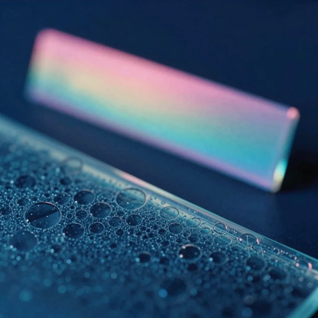
Material treatments were the hardest to render in pure CSS. A brushed metal coin needs a radial gradient with enough layers to imply anisotropic reflection, and enough inset shadow to imply the bevel. Frosted glass needs a backdrop blur plus a subtle noise texture or you get the "Zoom background" look instead of the Apple Store look. A wax seal press needed a squish-and-flash: the seal scales down briefly on press, then flashes pink through a mix-blend-mode: screen, then settles. Rubber stamp is an asymmetric ink distribution with edge roughness. Concrete chip is speckle with broken corners.
The test I ran in my head: could I describe this treatment to a craftsperson who has never seen a computer? If yes, it belongs in material. If no, it probably belongs in synthetic or light.
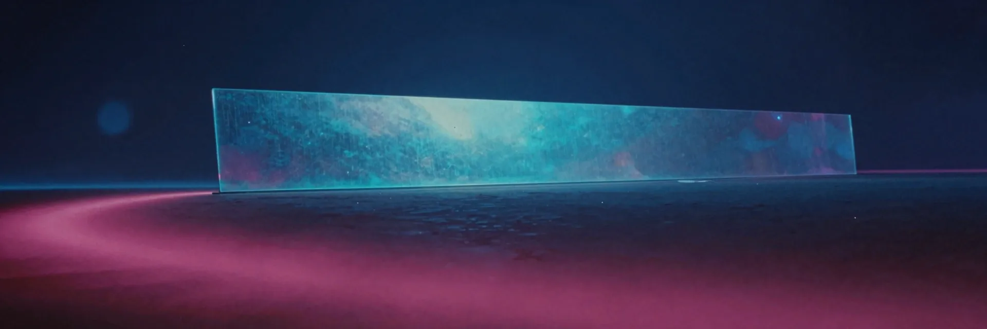
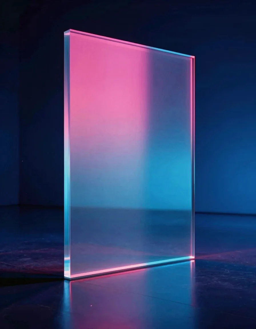
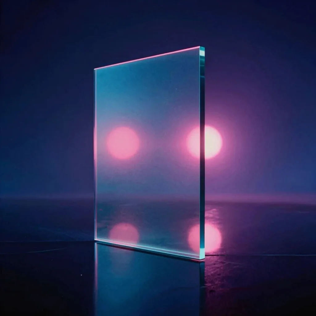
Light treatments are the ones where the card itself is almost invisible and you're just seeing what illumination does in the space around it. A neon wireframe is a glowing outline with a specific falloff curve. A god-ray sweep is a volumetric beam crossing the frame diagonally. Aurora liquid-metal is a gradient that slides like the northern lights on a sheet of mercury. Iridescent oil-slick is the interference pattern you get on a parking-lot puddle. Signal wave-line ripple is a sine wave on an oscilloscope, with the letter riding the crest.
Material and light end up being the families where the CSS gets weirdest. You're building effects that were designed for feature films, render farms, and glass manufacturers, and you have to fake them with three divs, a gradient, and a filter. That's part of why I wanted both families represented. The constraint of having to ship them in the same page forces the CSS vocabulary to stretch. That kind of stretching is what I look for in the short window each morning where concepting and building happen in the same session.
The three technical constraints every variant had to survive
The theme families are the editorial layer. Underneath, every single variant had to pass three hard tests, and I refactored any treatment that could not. These constraints come straight from the rules I wrote myself into the repo's agents file, which I keep coming back to because they protect the experience on mobile. This is the part where having the designer and the developer be the same person actually saves time: the constraints live in my head while I'm choosing the effect, not in a ticket I write to myself later.
No layout shift from animation. Every card's final dimensions are declared up front through CSS clamp() on width and height, so the container reserves its space before any letter renders. Animations use only transform, opacity, and filter. No margin, no padding, no width keyframes, no late-arriving children that push their siblings down. If a phone reloads the lab page mid-scroll, the cards stay pinned to the pixel where they first painted. The clamp values themselves come out of the same token scale I use everywhere else, which is why design tokens built to outlive a rebrand matter more than any single effect.
Respect for prefers-reduced-motion. Each variant checks the media query once on mount and either stops the interval entirely or snaps the cards to their final state. On a device with reduced motion enabled, the lab page renders as a static catalogue, with every card showing the current phrase and no animation loops running. I learned the hard way that "respects reduced motion" is not the same as "animates slower." Reduced motion means no loop.
Mobile-first at 320/390/768/1440 with zero horizontal overflow. I verified every variant at those four viewports with Playwright before merging. The flex rows shrink the gap, the letter clamps shrink the font-size, and the container overflow-hidden catches anything that tries to poke out. A flip widget that pushes the page three pixels sideways on a small phone is worse than no flip widget. I would rather ship six variants that behave than twenty that don't.
When not to ship 20 variants
The lab page is not the homepage. That distinction is doing more work than it looks like.
On a marketing page, variety is friction. A visitor arrives with intent, and every extra treatment between them and the next action is a tax. Pick one hero, one headline style, one button style, and ship that. Five card-flip effects on the homepage would make the site feel unserious, because variety reads as "we couldn't decide," not "we were being thorough."
On a lab page, variety is the product. The visitor arrives to see what the operator can do, and a single treatment would feel thin in the same way six variants felt thin to me last week. The lab is where you get to show the range you spent years building. The marketing page is where you show the one you picked.
The test I run before shipping range anywhere: would the visitor notice if it were missing? On a homepage, no. On a lab page, yes. That single question sorts the decision for me almost every time.
FAQ: shipping component variants with design variety
How many component variants is too many?
The honest answer is: as many as you can group into families of five, where each family has a one-word name. Beyond that, you're usually padding. I ship 20 when I can defend four families. If I can only defend two, I ship 10.
Should I build each variant as a separate component or parameterize one?
Separate components, when the variants are genuinely different visually. Parameterizing twenty flip effects into one component means the props object has forty keys and the JSX has forty conditional blocks. The CSS cannot be shared across these effects anyway; a brushed-metal gradient has nothing structurally in common with an ASCII waterfall. Write twenty small files.
How do I avoid layout shift when a card-flip widget is on mobile?
Pre-allocate the card's final dimensions with clamp() on width and height. Only animate transform, opacity, and filter. Put overflow: hidden on the container that hosts the row of cards. And test every viewport width you care about, not just the one your laptop shows you.
Do I really need to handle prefers-reduced-motion on a lab page?
Yes. A lab page with twenty animated variants is a vestibular hazard for anyone with motion sensitivity. The fix is small: read the media query once on mount, snap to the final state, skip the loop. It costs you six lines per variant and you get an accessible page for the users who need it.
How do I decide which family a new variant belongs to?
Ask whether the treatment has mass, lives on a screen, has a touchable surface, or only exists because of lighting. One of those usually fits. If none fit, the variant is either genuinely a new family (in which case you need four more like it) or it doesn't belong in the set.
Can I put variety like this on a marketing page?
Not this much. A marketing page wants one clear treatment, repeated consistently. Variety belongs on a lab page, a pattern library, or a portfolio piece where the range is the thing you're selling.
Sources and specifics
- The /lab widget on this site ships 20 flip-card variants grouped into 4 thematic families of 5, merged on 2026-04-24.
- Every variant pre-allocates card dimensions via CSS
clamp()and animates onlytransform,opacity, andfilterto prevent layout shift. - Every variant checks
prefers-reduced-motionon mount and snaps to the final state when enabled. - Every variant was verified at 320, 390, 768, and 1440 pixel viewports with zero horizontal overflow before merging.
- All 20 treatments are implemented in pure CSS and React state with no images, no canvas, and no three.js.